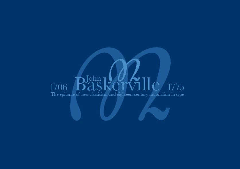
This is my final piece for a project which consisted of using a 'classic' typeface and use the elements within the glyphs pallet to create something dynamic and creative that enhances the features of the typeface. i chose Baskerville because its full of character and is transitional, although it is not very different from its predecessors the fine and bold strokes add quality and are more noticeable. I chose this as my final design because its very formal and it matches the character of the typeface itself also the use of one colour with different tones differentiating the foreground and background give it some depth and style.
No comments:
Post a Comment