
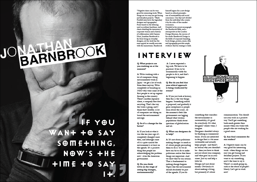
This project was to format a magazine spread in a way which was visually creative this allowed me to play around with a lot of elements and tools while experimenting. composition is important when it comes to working with text it can look plain and boring on its own which is why i attempted to bring it to life using a 'pull quote' and a typeface from Jonathan Barnbrook himself since it seemed to fit in with the project itself. the use of quotation in both of the designs shown adds some depth and some nice visual to the overall design making it more attractive and interesting to look at encouraging people to read the article rather than just glance.
No comments:
Post a Comment